
Anomaly Detection - Isolation Forest#
Notebook by:
Royi Avital RoyiAvital@fixelalgorithms.com
Revision History#
Version |
Date |
User |
Content / Changes |
|---|---|---|---|
1.0.000 |
21/04/2024 |
Royi Avital |
First version |
![]()
# Import Packages

# General Tools
import numpy as np
import scipy as sp
import pandas as pd

# Machine Learning
from sklearn.ensemble import IsolationForest, RandomForestClassifier
from sklearn.metrics import ConfusionMatrixDisplay
from sklearn.metrics import average_precision_score, auc, confusion_matrix, f1_score, precision_recall_curve, roc_curve

# Miscellaneous
import math
import os
from platform import python_version
import random
import timeit

# Typing
from typing import Callable, Dict, List, Optional, Self, Set, Tuple, Union

# Visualization
import matplotlib as mpl
import matplotlib.pyplot as plt
import seaborn as sns

# Jupyter
from IPython import get_ipython
from IPython.display import Image
from IPython.display import display
from ipywidgets import Dropdown, FloatSlider, interact, IntSlider, Layout, SelectionSlider
from ipywidgets import interact
Notations#
(?) Question to answer interactively.
(!) Simple task to add code for the notebook.
(@) Optional / Extra self practice.
(#) Note / Useful resource / Food for thought.
Code Notations:
someVar    = 2; #<! Notation for a variable
vVector    = np.random.rand(4) #<! Notation for 1D array
mMatrix    = np.random.rand(4, 3) #<! Notation for 2D array
tTensor    = np.random.rand(4, 3, 2, 3) #<! Notation for nD array (Tensor)
tuTuple    = (1, 2, 3) #<! Notation for a tuple
lList      = [1, 2, 3] #<! Notation for a list
dDict      = {1: 3, 2: 2, 3: 1} #<! Notation for a dictionary
oObj       = MyClass() #<! Notation for an object
dfData     = pd.DataFrame() #<! Notation for a data frame
dsData     = pd.Series() #<! Notation for a series
hObj       = plt.Axes() #<! Notation for an object / handler / function handler
Code Exercise#
Single line fill
vallToFill = ???
Multi Line to Fill (At least one)
# You need to start writing
????
Section to Fill
#===========================Fill This===========================#
# 1. Explanation about what to do.
# !! Remarks to follow / take under consideration.
mX = ???

???
#===============================================================#
# Configuration
# %matplotlib inline

seedNum = 512
np.random.seed(seedNum)
random.seed(seedNum)

# Matplotlib default color palette
lMatPltLibclr = ['#1f77b4', '#ff7f0e', '#2ca02c', '#d62728', '#9467bd', '#8c564b', '#e377c2', '#7f7f7f', '#bcbd22', '#17becf']
# sns.set_theme() #>! Apply SeaBorn theme

runInGoogleColab = 'google.colab' in str(get_ipython())
# Constants

FIG_SIZE_DEF    = (8, 8)
ELM_SIZE_DEF    = 50
CLASS_COLOR     = ('b', 'r')
EDGE_COLOR      = 'k'
MARKER_SIZE_DEF = 10
LINE_WIDTH_DEF  = 2

DATA_FILE_URL = r'https://raw.githubusercontent.com/nsethi31/Kaggle-Data-Credit-Card-Fraud-Detection/master/creditcard.csv'
# Courses Packages
import sys
sys.path.append('../')
sys.path.append('../../')
sys.path.append('../../../')
from utils.DataVisualization import PlotLabelsHistogram, PlotScatterData
# General Auxiliary Functions
Anomaly Detection by Isolation Forest#
In this note book we’ll use the Isolation Forest approach for anomaly detection.
The intuition in Isolation Forest is that the inliers are dense and hence in order to separate a sample from the rest many splits are needed.
This notebook introduces:
Working on real world data of credit card fraud.
Working with the
IsolationForestclass.Comparing supervised approach to unsupervised approach.
(#) Isolation Forest is a tree based model (Ensemble).
(?) Balance wise, how do you expect the data to look like?
# Parameters

# Data
numSamples = 500
noiseLevel = 0.1

# Model
numEstimators       = 50
contaminationRatio  = 'auto'

# Visualization

numGrdiPts = 201
Generate / Load Data#
In this notebook we’ll use the creditcard data set.
The datasets contains transactions made by credit cards in September 2013 by european cardholders.
This dataset present transactions that occurred in two days, where we have 492 frauds out of 284,807 transactions.
The dataset is highly unbalanced, the positive class (frauds) account for 0.172% of all transactions.
It contains only numerical input variables which are the result of a PCA transformation in order to preserve confidentiality.
(#) The features:
V1,V2, …,V28the PCA transformed data.(#) The
Classcolumn is the labeling whereClass = 1means a fraud transaction.
# Load Data

dfData = pd.read_csv(DATA_FILE_URL)


print(f'The features data shape: {dfData.shape}')
The features data shape: (284807, 31)
Plot the Data#
# Plot the Data

dfData.head()
| Time | V1 | V2 | V3 | V4 | V5 | V6 | V7 | V8 | V9 | ... | V21 | V22 | V23 | V24 | V25 | V26 | V27 | V28 | Amount | Class | |
|---|---|---|---|---|---|---|---|---|---|---|---|---|---|---|---|---|---|---|---|---|---|
| 0 | 0.0 | -1.359807 | -0.072781 | 2.536347 | 1.378155 | -0.338321 | 0.462388 | 0.239599 | 0.098698 | 0.363787 | ... | -0.018307 | 0.277838 | -0.110474 | 0.066928 | 0.128539 | -0.189115 | 0.133558 | -0.021053 | 149.62 | 0 |
| 1 | 0.0 | 1.191857 | 0.266151 | 0.166480 | 0.448154 | 0.060018 | -0.082361 | -0.078803 | 0.085102 | -0.255425 | ... | -0.225775 | -0.638672 | 0.101288 | -0.339846 | 0.167170 | 0.125895 | -0.008983 | 0.014724 | 2.69 | 0 |
| 2 | 1.0 | -1.358354 | -1.340163 | 1.773209 | 0.379780 | -0.503198 | 1.800499 | 0.791461 | 0.247676 | -1.514654 | ... | 0.247998 | 0.771679 | 0.909412 | -0.689281 | -0.327642 | -0.139097 | -0.055353 | -0.059752 | 378.66 | 0 |
| 3 | 1.0 | -0.966272 | -0.185226 | 1.792993 | -0.863291 | -0.010309 | 1.247203 | 0.237609 | 0.377436 | -1.387024 | ... | -0.108300 | 0.005274 | -0.190321 | -1.175575 | 0.647376 | -0.221929 | 0.062723 | 0.061458 | 123.50 | 0 |
| 4 | 2.0 | -1.158233 | 0.877737 | 1.548718 | 0.403034 | -0.407193 | 0.095921 | 0.592941 | -0.270533 | 0.817739 | ... | -0.009431 | 0.798278 | -0.137458 | 0.141267 | -0.206010 | 0.502292 | 0.219422 | 0.215153 | 69.99 | 0 |
5 rows × 31 columns
# Histogram of Labels

hA = PlotLabelsHistogram(dfData['Class'])
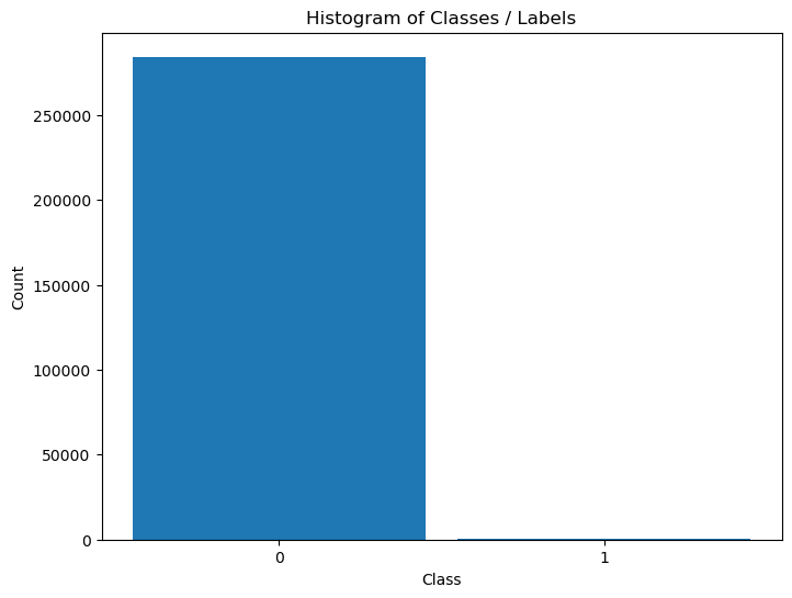
The data is highly imbalanced. Hence we might treat the fraud cases as outliers.
(?) Given the data as is, is that a supervised or unsupervised problem?
(?) Which approach would work better?
Pre Process Data#
We’ll remove the time data and separate the class data.
We’ll also convert the data into numeric form (NumPy arrays).
mX = dfData.drop(columns = ['Time', 'Class']).to_numpy()
vY = dfData['Class'].to_numpy()
Applying Outlier Detection - Isolation Forest#
This section applies the IsolationForest algorithm.
The Unsupervised Model is compared to a supervised model.
# Applying the Model
# UnSupervised Model - Isolation Forest

oIsoForestOutDet = IsolationForest(n_estimators = numEstimators, contamination = contaminationRatio)
oIsoForestOutDet = oIsoForestOutDet.fit(mX)
# Applying the Model
# Supervised Model - Random Forest

oRndForestCls = RandomForestClassifier(n_estimators = numEstimators, oob_score = True, n_jobs = -1)
oRndForestCls = oRndForestCls.fit(mX, vY)
Plot the Model Results#
We’ll analyze results using the ROC Curve of both methods.
# Score / Decision Function
vScoreRF =  oRndForestCls.oob_decision_function_[:, 1] #<! Score for Label 1
vScoreIF = -oIsoForestOutDet.decision_function(mX)
# ROC Curve Calculation

vFP_RF, vTP_RF, vThersholdRF = roc_curve(vY, vScoreRF, pos_label = 1)
vFP_IF, vTP_IF, vThersholdIF = roc_curve(vY, vScoreIF, pos_label = 1)

AUC_RF = auc(vFP_RF, vTP_RF)
AUC_IF = auc(vFP_IF, vTP_IF)
# Plot the ROC Curve

hF, hA = plt.subplots(figsize = FIG_SIZE_DEF)
hA.plot(vFP_RF, vTP_RF, color = 'b', lw = 3, label = f'RF  AUC = {AUC_RF :.3f} (Out of Bag Score)')
hA.plot(vFP_IF, vTP_IF, color = 'r', lw = 3, label = f'IF  AUC = {AUC_IF :.3f}')
hA.plot([0, 1], [0, 1], color = 'k', lw = 2, linestyle = '--')
hA.set_title ('ROC')
hA.set_xlabel('False Positive Rate')
hA.set_ylabel('True Positive Rate')
hA.axis ('equal')
hA.legend()
hA.grid()

plt.show()
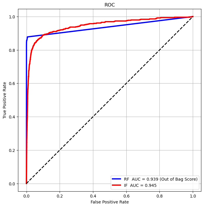
(?) Which method is better by the AUC score?
(?) Which method would you chose?
# Interpolate Performance by Threshold
v              = np.linspace(0, 1, numGrdiPts, endpoint = True)
vThersholdRF2  = np.interp(v, vFP_RF, vThersholdRF)
vThersholdIF2  = np.interp(v, vFP_IF, vThersholdIF)
def PlotConfusionMatrices(thrLvl):

    thrRF    = vThersholdRF2[thrLvl]
    thrIF    = vThersholdIF2[thrLvl]
    vHatY_RF = vScoreRF > thrRF
    vHatY_IF = vScoreIF > thrIF

    mC_RF = confusion_matrix(vY, vHatY_RF)
    mC_IF = confusion_matrix(vY, vHatY_IF)

    fig = plt.figure(figsize = (12, 8))
    ax  = fig.add_subplot(1, 2, 1)
    ax.plot(vFP_RF, vTP_RF, color = 'b', lw=3, label=f'RF AUC = {AUC_RF :.3f} (On train data)')
    ax.plot(vFP_IF, vTP_IF, color = 'r', lw=3, label=f'IF AUC = {AUC_IF :.3f}')
    ax.plot([0, 1], [0, 1], color = 'k', lw=2, linestyle='--')
    ax.axvline(x = thrLvl / (numGrdiPts - 1), color = 'g', lw = 2, linestyle = '--')
    ax.set_title ('ROC')
    ax.set_xlabel('False Positive Rate')
    ax.set_ylabel('True Positive Rate')
    ax.axis      ('equal')
    ax.legend    ()
    ax.grid      ()

    axRF = fig.add_subplot(2, 3, 3)
    axIF = fig.add_subplot(2, 3, 6)

    ConfusionMatrixDisplay(mC_RF, display_labels=['Normal', 'Fruad']).plot(ax=axRF)
    ConfusionMatrixDisplay(mC_IF, display_labels=['Normal', 'Fruad']).plot(ax=axIF)
    axRF.set_title('Random Forest   \n' f'f1_score = {f1_score(vY, vHatY_RF):1.4f}')
    axIF.set_title('Isolation Forest\n' f'f1_score = {f1_score(vY, vHatY_IF):1.4f}')
    plt.show        ()
# Interactive Plot
thrLvlSlider = IntSlider(min = 0, max = numGrdiPts - 1, step = 1, value = 0, layout = Layout(width = '30%'))
interact(PlotConfusionMatrices, thrLvl = thrLvlSlider)
plt.show()
(#) In the above, due to the imbalanced properties of the data the AUC isn’t a good score.
Precision Recall Curve#
For highly imbalanced data, the Precision Recall Curve is usually a better tool to analyze performance.
(#) The Precision Recall Curve isn’t guaranteed to be monotonic.
# Curve Vectors
vPR_RF, vRE_RF, vThersholdPrReRF = precision_recall_curve(vY, vScoreRF, pos_label = 1)
vPR_IF, vRE_IF, vThersholdPrReIF = precision_recall_curve(vY, vScoreIF, pos_label = 1)

# Average Precision Score, Somewhat equivalent to the AUC for the PR Curve
AUC_PrReRF = average_precision_score(vY, vScoreRF, pos_label = 1)
AUC_PrReIF = average_precision_score(vY, vScoreIF, pos_label = 1)
hF, hA = plt.subplots(figsize = FIG_SIZE_DEF)
hA.plot(vRE_RF, vPR_RF, color = 'b', lw = 3, label = f'RF  Average Precision = {AUC_PrReRF :.3f} (Out of Bag Score)')
hA.plot(vRE_IF, vPR_IF, color = 'r', lw = 3, label = f'IF  Average Precision = {AUC_PrReIF :.3f}')
hA.set_title ('Precision Recall Curve')
hA.set_xlabel('Recall')
hA.set_ylabel('Precision')
hA.axis('equal')
hA.legend()
hA.grid()
plt.show()
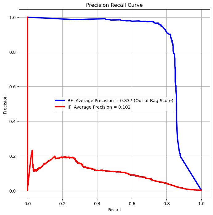
(?) Which score would you optimize in the case above?
summary#
supervised will be better because we have the labels