Hierarchical Clustering#
This notebook focuses on Agglomerative Clustering (Bottom Up).
Notebook by:
Royi Avital RoyiAvital@fixelalgorithms.com
Revision History#
Version |
Date |
User |
Content / Changes |
|---|---|---|---|
1.0.000 |
13/04/2024 |
Royi Avital |
First version |
![]()
# Import Packages

# General Tools
import numpy as np
import scipy as sp
import pandas as pd

# Machine Learning
from sklearn.base import BaseEstimator, ClusterMixin

# Miscellaneous
import math
import os
from platform import python_version
import random
import timeit

# Typing
from typing import Callable, Dict, List, Optional, Self, Set, Tuple, Union

# Visualization
import matplotlib as mpl
import matplotlib.pyplot as plt
import seaborn as sns

# Jupyter
from IPython import get_ipython
from IPython.display import Image
from IPython.display import display
from ipywidgets import Dropdown, FloatSlider, interact, IntSlider, Layout, SelectionSlider
from ipywidgets import interact
Notations#
(?) Question to answer interactively.
(!) Simple task to add code for the notebook.
(@) Optional / Extra self practice.
(#) Note / Useful resource / Food for thought.
Code Notations:
someVar    = 2; #<! Notation for a variable
vVector    = np.random.rand(4) #<! Notation for 1D array
mMatrix    = np.random.rand(4, 3) #<! Notation for 2D array
tTensor    = np.random.rand(4, 3, 2, 3) #<! Notation for nD array (Tensor)
tuTuple    = (1, 2, 3) #<! Notation for a tuple
lList      = [1, 2, 3] #<! Notation for a list
dDict      = {1: 3, 2: 2, 3: 1} #<! Notation for a dictionary
oObj       = MyClass() #<! Notation for an object
dfData     = pd.DataFrame() #<! Notation for a data frame
dsData     = pd.Series() #<! Notation for a series
hObj       = plt.Axes() #<! Notation for an object / handler / function handler
Code Exercise#
Single line fill
vallToFill = ???
Multi Line to Fill (At least one)
# You need to start writing
????
Section to Fill
#===========================Fill This===========================#
# 1. Explanation about what to do.
# !! Remarks to follow / take under consideration.
mX = ???

???
#===============================================================#
# Configuration
# %matplotlib inline

seedNum = 512
np.random.seed(seedNum)
random.seed(seedNum)

# Matplotlib default color palette
lMatPltLibclr = ['#1f77b4', '#ff7f0e', '#2ca02c', '#d62728', '#9467bd', '#8c564b', '#e377c2', '#7f7f7f', '#bcbd22', '#17becf']
# sns.set_theme() #>! Apply SeaBorn theme

runInGoogleColab = 'google.colab' in str(get_ipython())
# Constants

FIG_SIZE_DEF    = (8, 8)
ELM_SIZE_DEF    = 50
CLASS_COLOR     = ('b', 'r')
EDGE_COLOR      = 'k'
MARKER_SIZE_DEF = 10
LINE_WIDTH_DEF  = 2
# Courses Packages
import sys
sys.path.append('../')
sys.path.append('../../')
sys.path.append('../../../')
from utils.DataVisualization import PlotDendrogram
# General Auxiliary Functions
Clustering by Agglomerative (Bottom Up) Policy#
In this note book we’ll use the Agglomerative method for clustering.
We’ll use the SciPy hierarchy module to create a SciKit Learn compatible clustering class.
(#) SciKit Learn has a class for agglomerative clustering:
AgglomerativeClustering. Which is basically based on SciPy.(#) The “magic” in those method is the definition of the relation between samples and sub sets of samples.
# Parameters

# Data Generation
csvFileName = r'https://github.com/FixelAlgorithmsTeam/FixelCourses/raw/master/DataSets/ShoppingData.csv'

# Model
linkageMethod   = 'ward'
thrLvl          = 200
clusterCriteria = 'distance'
Generate / Load Data#
The data is based on the Shopping Data csv file.
(#) The data is known as
Mall_Customers.csv. See Machine Learning with Python - Datasets.(#) Available at Kaggle -
Mall_Customers.
# Load Data

dfData = pd.read_csv(csvFileName)

print(f'The features data shape: {dfData.shape}')
The features data shape: (200, 5)
# The Data Frame

dfData.head(10)
| CustomerID | Genre | Age | Annual Income (k$) | Spending Score (1-100) | |
|---|---|---|---|---|---|
| 0 | 1 | Male | 19 | 15 | 39 |
| 1 | 2 | Male | 21 | 15 | 81 |
| 2 | 3 | Female | 20 | 16 | 6 |
| 3 | 4 | Female | 23 | 16 | 77 |
| 4 | 5 | Female | 31 | 17 | 40 |
| 5 | 6 | Female | 22 | 17 | 76 |
| 6 | 7 | Female | 35 | 18 | 6 |
| 7 | 8 | Female | 23 | 18 | 94 |
| 8 | 9 | Male | 64 | 19 | 3 |
| 9 | 10 | Female | 30 | 19 | 72 |
# Rename the Genre Column
dfData = dfData.rename(columns = {'Genre': 'Sex'})
dfData
| CustomerID | Sex | Age | Annual Income (k$) | Spending Score (1-100) | |
|---|---|---|---|---|---|
| 0 | 1 | Male | 19 | 15 | 39 |
| 1 | 2 | Male | 21 | 15 | 81 |
| 2 | 3 | Female | 20 | 16 | 6 |
| 3 | 4 | Female | 23 | 16 | 77 |
| 4 | 5 | Female | 31 | 17 | 40 |
| ... | ... | ... | ... | ... | ... |
| 195 | 196 | Female | 35 | 120 | 79 |
| 196 | 197 | Female | 45 | 126 | 28 |
| 197 | 198 | Male | 32 | 126 | 74 |
| 198 | 199 | Male | 32 | 137 | 18 |
| 199 | 200 | Male | 30 | 137 | 83 |
200 rows × 5 columns
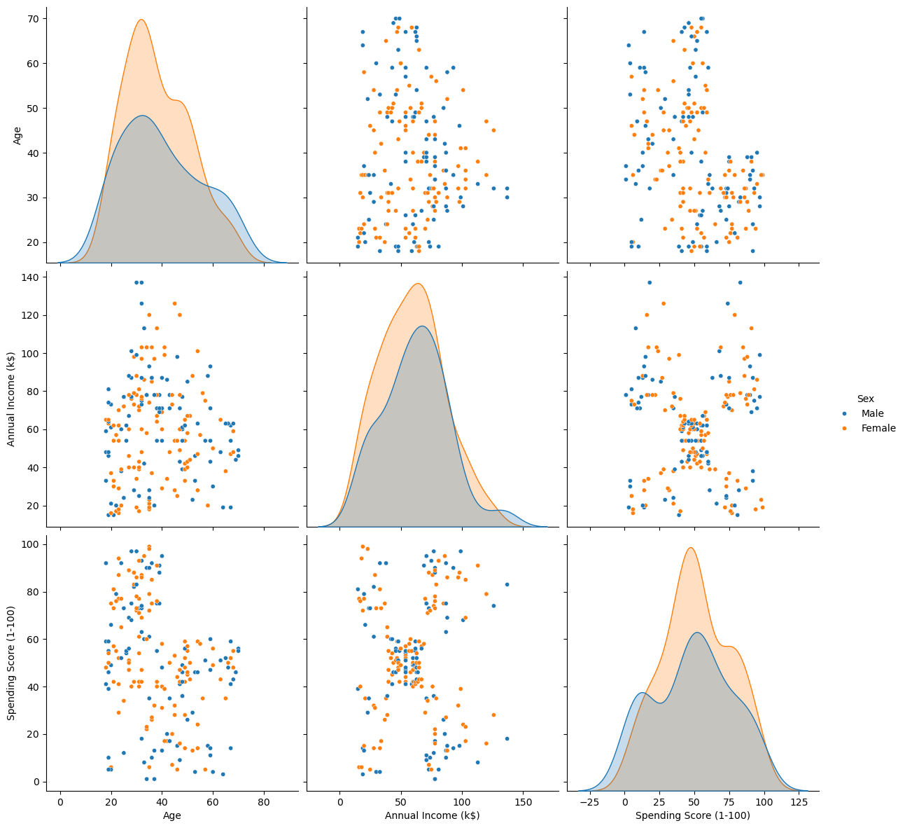
Plot Data#
# Plot the Data
# Pair Plot of the data (Excluding ID)

sns.pairplot(dfData, vars = ['Age', 'Annual Income (k$)', 'Spending Score (1-100)'], hue = 'Sex', height = 4, plot_kws = {'s': 20})
plt.show()
Pre Process Data#
# Remove ID data
dfX = dfData.drop(columns = ['CustomerID'], inplace = False)
dfX['Sex'] = dfX['Sex'].map({'Female': 0, 'Male': 1}) #<! Convert the 'Sex' column into {0, 1} values
dfX
| Sex | Age | Annual Income (k$) | Spending Score (1-100) | |
|---|---|---|---|---|
| 0 | 1 | 19 | 15 | 39 |
| 1 | 1 | 21 | 15 | 81 |
| 2 | 0 | 20 | 16 | 6 |
| 3 | 0 | 23 | 16 | 77 |
| 4 | 0 | 31 | 17 | 40 |
| ... | ... | ... | ... | ... |
| 195 | 0 | 35 | 120 | 79 |
| 196 | 0 | 45 | 126 | 28 |
| 197 | 1 | 32 | 126 | 74 |
| 198 | 1 | 32 | 137 | 18 |
| 199 | 1 | 30 | 137 | 83 |
200 rows × 4 columns
Cluster Data by Hierarchical Agglomerative (Bottom Up) Clustering Method#
The algorithm works as following:
Set \({\color{magenta}\mathcal{C}}\), the set of all clusters:
While \(\left| {\color{magenta}\mathcal{C}} \right| > 1\):
Set \({\color{green}\mathcal{C}_{i^{\star}}},{\color{green}\mathcal{C}_{j^{\star}}}\leftarrow\arg\min_{{\color{green}\mathcal{C}_{i}},{\color{green}\mathcal{C}_{j}}\in{\color{magenta}\mathcal{C}}}d_{\mathcal{C}}\left({\color{green}\mathcal{C}_{i}},{\color{green}\mathcal{C}_{j}}\right)\).
Set \({\color{green}\widetilde{\mathcal{C}}}\leftarrow{\color{green}\mathcal{C}_{i^{\star}}}\cup{\color{green}\mathcal{C}_{j^{\star}}}\).
Set \({\color{magenta}\mathcal{C}}\leftarrow{\color{magenta}\mathcal{C}}\backslash\left\{ {\color{green}\mathcal{C}_{i^{\star}}},{\color{green}\mathcal{C}_{j^{\star}}}\right\} \).
Set \({\color{magenta}\mathcal{C}}\leftarrow{\color{magenta}\mathcal{C}}\cup{\color{green}\widetilde{C}}\).
The Hyper Parameters of the model are:
The clusters dissimilarity function.
The clustering threshold.
(#) SciKit Learn has a class for agglomerative clustering:
AgglomerativeClustering. Which is basically based on SciPy.
# Implement the Hierarchical Agglomerative clustering as an Estimator

class HierarchicalAgglomerativeCluster(ClusterMixin, BaseEstimator):
    def __init__(self, linkageMethod: str, thrLvl: Union[int, float], clusterCriteria: str) -> None:
        self.linkageMethod      = linkageMethod
        self.thrLvl             = thrLvl
        self.clusterCriteria    = clusterCriteria

        pass

    def fit(self, mX: Union[np.ndarray, pd.DataFrame], vY: Union[np.ndarray, pd.Series, None] = None) -> Self:

        numSamples  = mX.shape[0]
        featuresDim = mX.shape[1]

        mLinkage = sp.cluster.hierarchy.linkage(mX, method = self.linkageMethod)
        vL       = sp.cluster.hierarchy.fcluster(mLinkage, self.thrLvl, criterion = self.clusterCriteria)

        self.mLinkage           = mLinkage
        self.labels_            = vL
        self.n_features_in      = featuresDim

        return self

    def transform(self, mX: Union[np.ndarray, pd.DataFrame]) -> np.ndarray:

        return sp.hierarchy.linkage(mX, method = self.linkageMethod)

    def predict(self, mX: Union[np.ndarray, pd.DataFrame]) -> np.ndarray:

        vL = sp.cluster.hierarchy.fcluster(self.mLinkage, self.thrLvl, criterion = self.clusterCriteria)

        return vL
(?) In the context of a new data, what’s the limitation of this method?
# Plotting Wrapper
hPlotDendrogram = lambda linkageMethod, thrLvl: PlotDendrogram(dfX, linkageMethod, 200, thrLvl, figSize = (8, 8))
# Interactive Visualization

# TODO: Add Criteria for `fcluster`
linkageMethodDropdown = Dropdown(description = 'Linakage Method', options = [('Single', 'single'), ('Complete', 'complete'), ('Average', 'average'), ('Weighted', 'weighted'), ('Centroid', 'centroid'), ('Median', 'median'), ('Ward', 'ward')], value = 'ward')
# criteriaMethodDropdown = Dropdown(description = 'Linakage Method', options = [('Single', 'single'), ('Complete', 'complete'), ('Average', 'average'), ('Weighted', 'weighted'), ('Centroid', 'centroid'), ('Median', 'median'), ('Ward', 'ward')], value = 'ward')
thrLvlSlider = IntSlider(min = 1, max = 1000, step = 1, value = 100, layout = Layout(width = '30%'))
interact(hPlotDendrogram, linkageMethod = linkageMethodDropdown, thrLvl = thrLvlSlider)

plt.show()
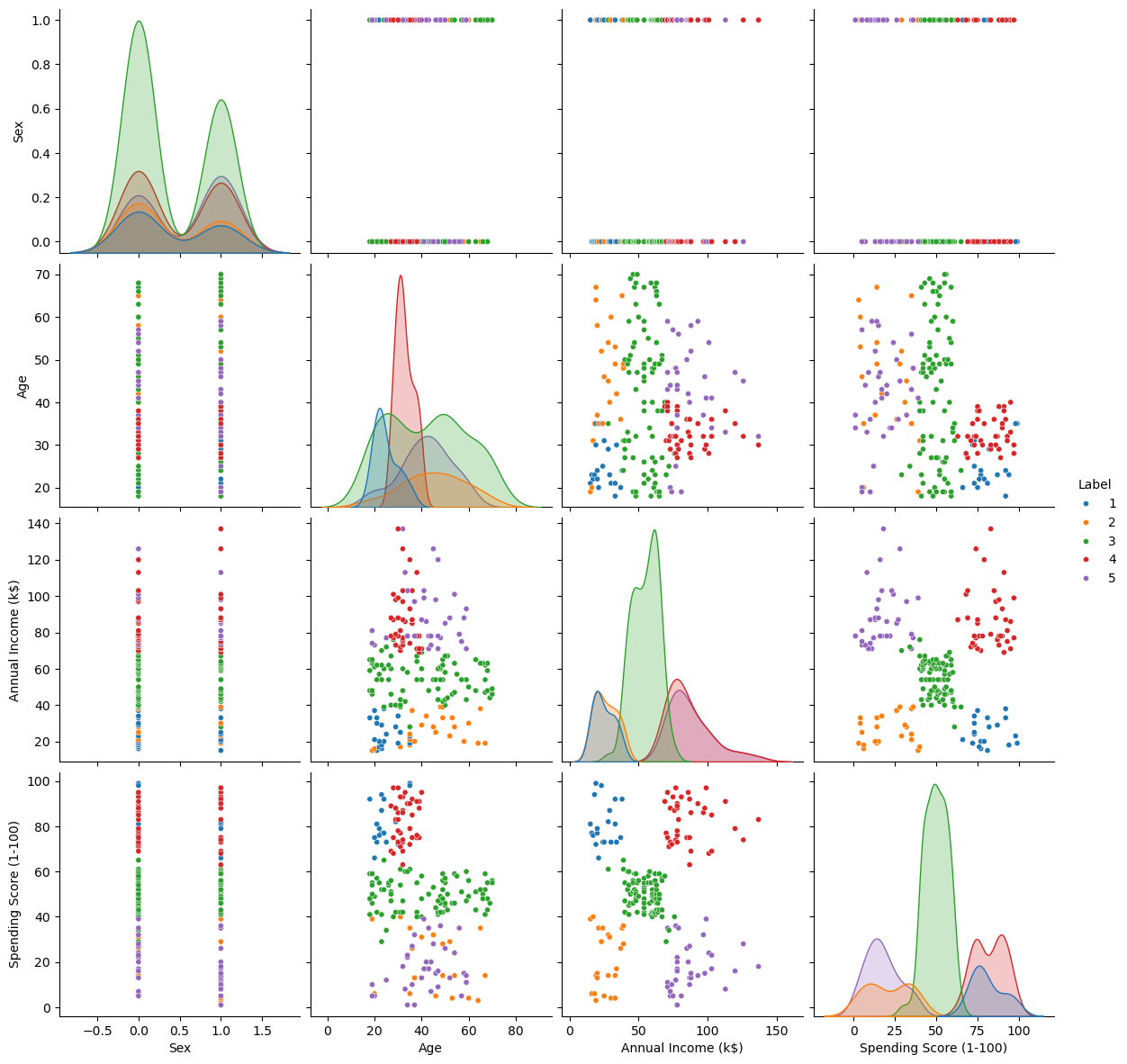
Clustering as Feature#
We can visualize the effect on the data by treating the clustering labels as a feature.
# Build and Train the Model
oAggCluster = HierarchicalAgglomerativeCluster(linkageMethod = linkageMethod, thrLvl = thrLvl, clusterCriteria = clusterCriteria)
oAggCluster = oAggCluster.fit(dfX)
# Add the Cluster ID as a Feature
dfXX            = dfX.copy()
dfXX['Label']   = oAggCluster.labels_
# Feature Analysis
sns.pairplot(dfXX, hue = 'Label', palette = sns.color_palette()[:oAggCluster.labels_.max()], height = 3, plot_kws = {'s': 20})
plt.show()