Gene PCA DEMO LAB#
## NOTE: This is Python 3 code.
import pandas as pd
import numpy as np
import random as rd
from sklearn.decomposition import PCA
from sklearn import preprocessing
from sklearn.preprocessing import StandardScaler
import matplotlib.pyplot as plt
Data Generation Code#
## In this example, the data is in a data frame called data.
## Columns are individual samples (i.e. cells)
## Rows are measurements taken for all the samples (i.e. genes)
## Just for the sake of the example, we'll use made up data...
genes = ['gene' + str(i) for i in range(1,101)]

wt = ['wt' + str(i) for i in range(1,6)]
ko = ['ko' + str(i) for i in range(1,6)]

data = pd.DataFrame(columns=[*wt, *ko], index=genes)

for gene in data.index:
    data.loc[gene,'wt1':'wt5'] = np.random.poisson(lam=rd.randrange(10,1000), size=5)
    data.loc[gene,'ko1':'ko5'] = np.random.poisson(lam=rd.randrange(10,1000), size=5)

print(data.head())
print(data.shape)
       wt1  wt2  wt3  wt4  wt5  ko1  ko2  ko3  ko4  ko5
gene1  652  663  703  645  646  745  767  768  774  818
gene2  122  115  123  113  117  905  875  925  980  884
gene3  614  610  623  601  608  780  765  729  729  692
gene4   24   26   16   27   32  444  389  409  375  410
gene5  700  725  695  647  706  937  924  898  891  964
(100, 10)
Perform PCA on the data#
# First center and scale the data
scaled_data = preprocessing.scale(data.T) ## scale need the samples to be rows!
## better method:
#  StandardScaler().fit_transform(data.T)

pca = PCA() # create a PCA object
pca.fit(scaled_data) # do the math
pca_data = pca.transform(scaled_data) # get PCA coordinates for scaled_data
Draw a scree plot and a PCA plot#
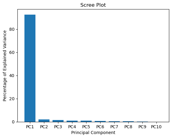
#The following code constructs the Scree plot
per_var = np.round(pca.explained_variance_ratio_* 100, decimals=1)
labels = ['PC' + str(x) for x in range(1, len(per_var)+1)]
plt.bar(x=range(1,len(per_var)+1), height=per_var, tick_label=labels)
plt.ylabel('Percentage of Explained Variance')
plt.xlabel('Principal Component')
plt.title('Scree Plot')
plt.show()
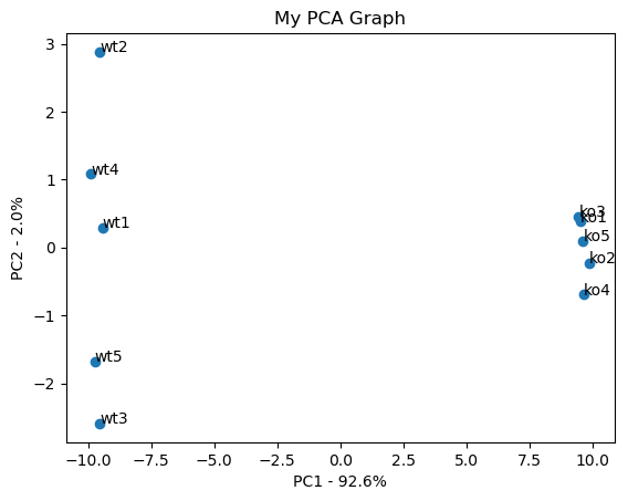
#the following code makes a fancy looking plot using PC1 and PC2
pca_df = pd.DataFrame(pca_data, index=[*wt, *ko], columns=labels)
plt.scatter(pca_df.PC1, pca_df.PC2)
plt.title('My PCA Graph')
plt.xlabel('PC1 - {0}%'.format(per_var[0]))
plt.ylabel('PC2 - {0}%'.format(per_var[1]))
for sample in pca_df.index:
plt.annotate(sample, (pca_df.PC1.loc[sample], pca_df.PC2.loc[sample]))
plt.show()
Determine which genes had the biggest influence on PC1#
## get the name of the top 10 measurements (genes) that contribute
## most to pc1.
## first, get the loading scores
loading_scores = pd.Series(pca.components_[0], index=genes)  ### pc1=index0
## now sort the loading scores based on their magnitude
sorted_loading_scores = loading_scores.abs().sort_values(ascending=False)

# get the names of the top 10 genes
top_10_genes = sorted_loading_scores[0:10].index.values

## print the gene names and their scores (and +/- sign)
print(loading_scores[top_10_genes])
gene83   -0.103892
gene43   -0.103856
gene77   -0.103836
gene70    0.103821
gene29   -0.103809
gene78    0.103802
gene10    0.103797
gene35    0.103796
gene97    0.103790
gene23   -0.103785
dtype: float64